![XUno logo White with border.png]](https://docs.xuno.com.au/hs-fs/hubfs/XUno%20logo%20White%20with%20border.png?height=35&name=XUno%20logo%20White%20with%20border.png)
Each graph that is displayed can be changed to suit your needs.
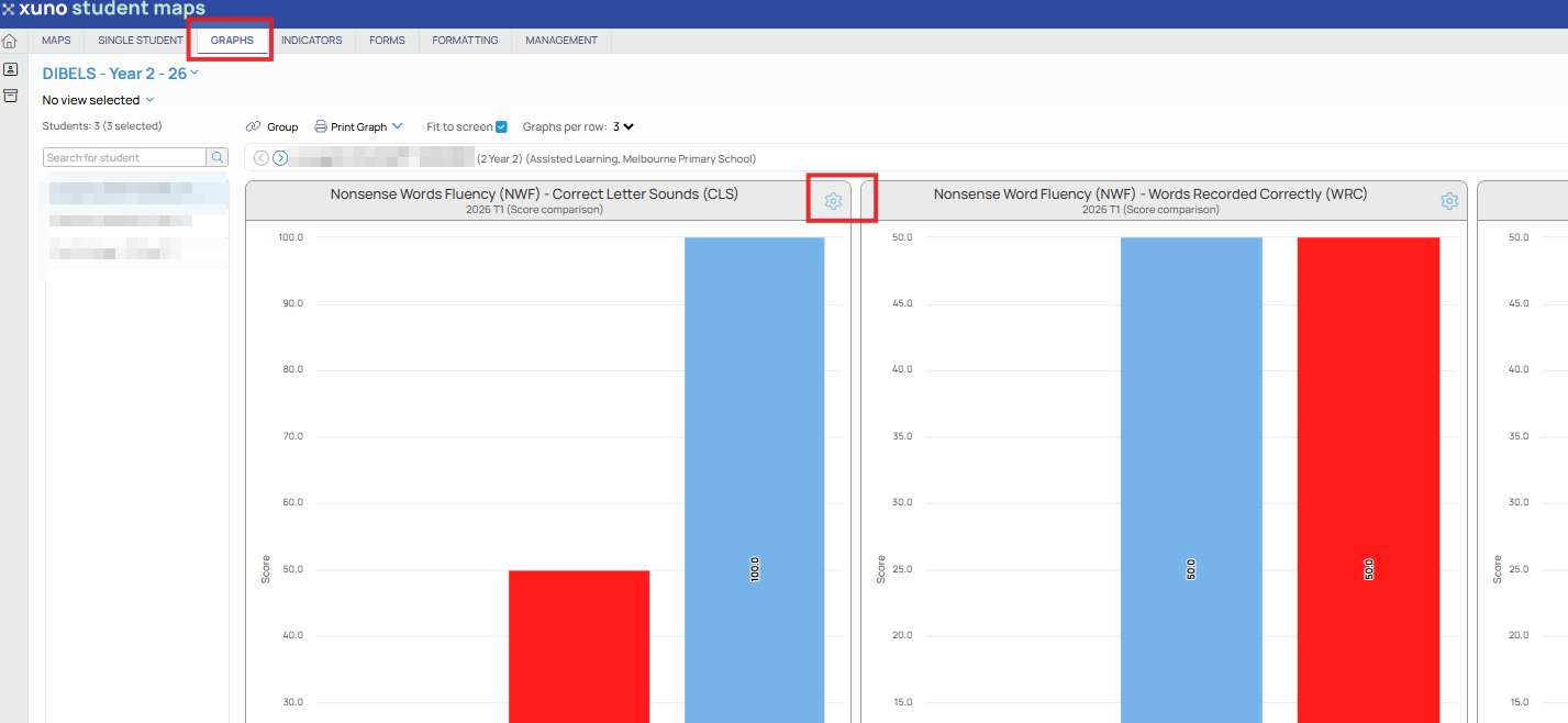
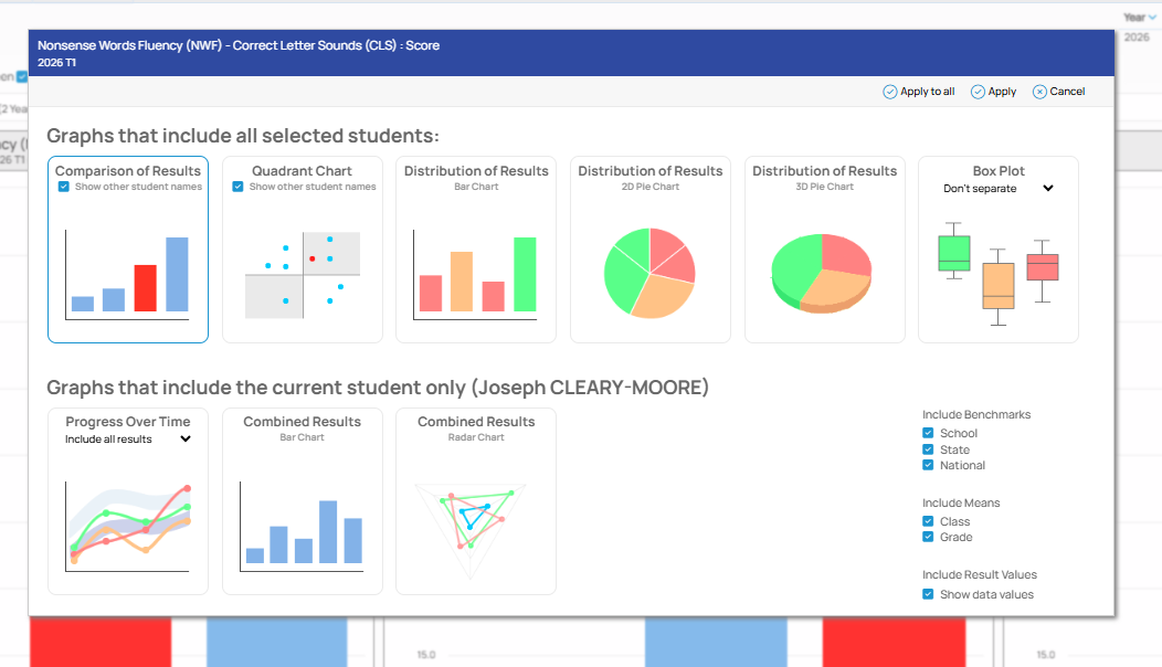
• Select a different type of graph by clicking the Settings icon in the top right corner of the graph to change. You can also click any white space on a graph to display the graph selection options screen.
• Then select the type of graph you want to change this one to, by selecting one of the options shown.
Comparison of Results
• See results for all selected students in a bar graph, comparing each student in that group to every other student in that group.
• If a student has been selected to highlight their data, their outcome will be shown as a red bar, compared to other students’ outcomes in blue.
• You can also select whether to show or hide other student names in the comparison chart. This is useful when you want to present these graphs to parents and remove any identifying information for the other students shown in the graph.
Distribution of Results
• A distribution chart groups all students together by outcome, showing the percentage of students in your selected cohort that have achieved a specific level.
• For example, if you have outcomes set up as A-E, then you will see 5 bars, one for each letter, and each bar or pie segment shows the percentage of the total number of selected students that achieved that letter score.
• Distribution charts can be shown as a bar chart, 2D pie chart, 3D pie chart or box plot graph.
• If a student has been selected to highlight their data, the grouping label that their result falls into is highlighted (percentage shown in red), making it easy to identify where the current student sits in a distribution bar chart or pie chart.
Box Plot Graph
A box plot displays the five-number summary of a set of results. The five-number summary is the minimum result, first quartile, median result, third quartile and maximum result. In a box plot, a box is drawn from the first quartile to the third quartile. A vertical line goes through the box at the median (middle value). A line extends from the bottom of the box to the lowest value, and another line extends from the top of the box to the highest value.
• When selecting a box plot, you can also choose to display the results by grade (year level), class or gender into separate box plots on the same graph, giving you a clearer view of the distribution of results by grade, class, gender, or none.
Progress Over Time
• Select this graph option to display a single student’s progress over time in the selected assessment.
• All assessment results for that student for that assessment will be retrieved from the database and charted in chronological order, meaning you don’t need to include all this historical data in the current map as it will be loaded from the database.
• This will show a line graph of their progress over time in that assessment.
• Along with the student’s progress over time (blue line), their class’s progress over time is also shown (amber line). This allows you to compare the student’s progress to the average of their class over the same period.
• Additionally, the whole year level’s progress over time for the same time period is shown as well, in green. This allows you to compare student, cohort and whole year level progress over time.
• You can also include school, state or national benchmarks on a progress over time graph. These benchmarks are entered in the GradeXpert desktop application.
• You can also change the number of years of data to include in a progress over time graph by selecting one of the items in the Progress Over Time drop-down list. This will limit the data shown to just the time period selected, e.g. last 2 years only, or all data. • You can include or exclude any of the school, state and national benchmarks from the graph, as well as class and grade means, by ticking or unticking any of these checkboxes.
Combined Results
• This graph option allows you to see just the selected student’s results for all the selected assessments, in a single view.
• This does not include progress over time or any other student’s data.
• This is useful when you have selected, say, 3 different literacy assessments to graph and you want to compare one student’s outcome in all 3 tests in a single view.
• The combined results are shown as a bar chart by default, but can be changed to a radar chart, which shows the same assessments in a radar view.
• Each line on the radar chart emanating from the centre of the chart is a different assessment, with the student’s outcome for that test shown as a blue dot, connected to the other assessments by a blue line.
• You can also show or hide the cohort averages and year level averages for those assessments by clicking the labels in the legend below the graph.
Graphing – Grouped Results
If you have selected two or more sets of results (columns) to graph in a map, they are shown as separate graphs by default.
• You can click the Group button to show all the sets of data on a single graph, grouped by student. This means you can select, for example, Reading, Writing, Spelling and Grammar assessment results to be shown in a group of graphs per student (i.e. each student will display 4 bars grouped by that student).
• This gives you a clearer picture of student achievement in multiple assessment areas, or over a period, instead of looking at four different graphs.
• Click the Group button again (which will now read Ungroup) to separate the sets of results into their own graphs.